Inkscape and Scalable Vector Graphics

One of my current favourite open source drawing tools is Inkscape (available from Inkscape.org). I’m planning on giving a talk and/or tutorial about basic Inkscape drawing to the Falkirk Linux Users Group and Edinburgh Linux Users Group at some point over the coming months, so I’m using this space to get my ideas together.

A Bit About Scalable Vector Graphics

Once upon a time, I would have told everyone to use The GIMP for all their graphics needs, but these days I prefer Scalable Vector Graphics (SVGs) and The GIMP is a bitmap editor. SVGs allow me to resize the image without changing the quality of the image. However large or small,the image won’t become pixelated. Most of my drawings are used on business cards or websites so scaling isn’t too much of an issue, but I tend to release my artwork and photos under a Creative Commons Attribution license to anyone else who might want to use them – and they may want to put the image on posters, t-shirts, or billboards!

A Bit About Inkscape

Inkscape is Free (gratis). It’s also open source. It works on Windows, Mac, and also on Linux (which I have on two of my three computers). It’s a fairly lightweight application; outputs images as SVG, PDF, or the bitmap of your choice; and has a fantastically simple user interface. I used Inkscape and it worked beautifully for what I wanted to do, so I kept with it.

I’m not an Adobe Illustrator user – the work I did was never advanced enough to justify the expense of it (a single-seat subscription to Illustrator costs $29/month for a year*).  Since I only know about Inkscape, I’ll let other people on the internet explain the functional differences between Inkscape and Adobe Illustrator:

* according to the Adobe website (as of 06 January 2012)

A Bride and Groom as a Scalable Vector Graphic

A bride and kilted groom

I’ve done a half-dozen logos in Inkscape so far (which you can browse in my publicity portfolio). My most recent artwork was this drawing of a bride and Scottish groom for my wedding invitations.

From the beginning, my partner and I intended to create printed postcards instead of traditional wedding invitation cards. We planned to design them ourselves and get them printed, so off to Google I went  in search of inspiration. After a week of looking at thousands of different invitation designs in search of a design that I liked, I found one at weddinginvitations.co.uk.

The image wasn’t quite what I was looking for (not least because my groom will be wearing a kilt) so I thought I’d try my hand at re-drawing it as an SVG.  The company who printed our invitation postcards had design guidelines that suggested keeping the image in SVG format to ensure the best printing quality. In addition, I wasn’t entirely sure where we were going to be using the image, other than on the invitations and ‘Thank You’ cards. I could yet decide to put them on minicards to act as nametags on the tables, or make it an image on our wedding website. The flexibility of the SVG format is difficult to argue with.

Basic Inkscape Drawing

Rough shapes used for wedding couple drawing

I’d started creating the bride and Scottish groom image in Inkscape by freehand drawing with my Wacom tablet (as I’d done ages ago with a different drawing). After I finished sketching, I selected all the nodes and simplified them (Path > Simplify) to reduce the number of nodes but retain the curves. For example, a freehand line may have 50 nodes, but after simplifying there may only be 5.

I then realised that the shapes I was ending up with were incredibly simple — so I started over again, but using the bezier tool instead of the freehand tool. If you have a look at this basic shape drawing, you can see that the wedding dress in the image is effectively a triangle and the kilt is only a trapezoid.
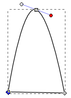
Then it was down to making the lines curve the way I wanted them to. I did this by selecting individual nodes and using the node tools to make the node smooth (making it a curve instead of a sharp angle). When I did that, I also got handles for the node to adjust the direction of the curve. I adjusted the line between two nodes simply by clicking on the line and dragging it where I wanted it.

The whole wedding couple design was done with simple shapes, making making nodes smooth, and dragging lines around. I then did a bit of colouring but all the colours are solid so I didn’t have to worry about getting gradients correct.

The design is not very complicated, but I think its charm is in its simplicity.

A Talk and Tutorial on Inkscape

I’ll post here later about my talk and tutorial on Inkscape for Falkirk LUG and EdLUG.  I’ll also be sure to put my notes and/or slides here to share.  These are the topics I’m currently planning to cover. If there are any others that you feel need to be mentioned, please get in touch!

  • What is an SVG? How does it compare to a bitmap?
  • What is Inkscape?
  • How do I use the shape tools (square, circle, stars, spirals)?
  • How do I change the fill colour, line colour, and line thickness?
  • How do I combine and subtract shapes?
  • How do I use the freehand and calligraphy tools?

Open Source Orientation

How many of you have heard this before:

“I had a look at [product] but I couldn’t quite figure out how it works. There was a community message board, but no real documentation.”

Welcome to the world of open source software, where there is a sad lack of documentation. I know, I’m not really in a position to complain, being one of the people in the community who could write some documentation for community project but hasn’t really. Well, except for this one time…

Picture it – the year is 2010 and I am on the cusp of graduating from university, with a degree in Linguistics and only a year of technical writing experience. I’ve spent the last two years evangelising about the wonder that is the open source community and I want to jump in and do all I can to help. So I went along to the Open Source Jump Start 2010 in London. I’m in a room with 30 other university idealists who want to help something bigger then themselves. There are project leaders from many different open source projects – and they take us by the hand and introduce us to their projects.

That’s the hardest thing, getting started. With no documentation, and no one to explain what this particular program is meant to do, I’m lost. I can read code, but it takes me awhile – like someone with a knowledge of Spanish attempting to puzzle through Portugese. It really does take either a fair amount of discussion on a message board, or a sit-down with one of the developers to really understand how something works.

That was the beauty of the Open Source Jumpstart – the would-be programmers had a chance to discuss the project and its organisation. I, too, had the opportunity to talk to the project leader of the Citrine Scheduler project and write a bit of documentation.

I want to organise something like that in Edinburgh, where I know there are people who would want to get involved, students who need to work on open source projects for their degree and folks who’d love to help out the community but don’t know where to start. That’s what I had said on the day I was there, something I have talked about on-and-off ever since. Now that I’m back in Scotland, I don’t have an excuse anymore.

It’s more than just documentation — documentation helps get your foot in the door, but talking over pizza also helps get your foot in the door.

Anyone else want in?

Writing Tools

One of my fellow technical writers asked me a question that should have been easy enough to answer:

After spending the last year using FrameMaker 8, what would you want to use if you started at a new company that didn’t have any existing documentation? Would you want to go back to LaTeX or would you ask them to pay for you to get FrameMaker?

I was first of all amused that she didn’t assume that I would go for RoboHelp, one of the other documentation programs we use. There was also the assumption that I wouldn’t want to try something I’ve never tried before.

Then I had a think about it.

  • Am I a lone writer because they have very little documentation that needs to be created or am I the first of what will eventually be a team of many?
  • Is the documentation going to be online help, CHM, PDF?
  • How much money does the company have to spend on documentation, after paying me?
  • Does the documentation need to be released as soon as possible or is the software in the early stages of development, giving me time to develop the doc set?

All of these thoughts come together to decide how I would approach new documentation.

I know there are other tools available that I wouldn’t use for customer-facing documents, such as wikis (because of how difficult it is to keep them structured and ensure that all your pages are up-to-date) and plain text files (acceptable for short READMEs, but messy for long documents). There are also long lists of tools that I’ve never used before so don’t know the value of, such as Flare, DITA, and Author-It.

My first technical writing job, I worked for a very small company. I wrote everything in LaTeX, due to the ability to make a nice template, the ease of adding content, and the openness of the software to edit it. Free software to create the doc, ability to output as PDF and HTML. Everyone’s happy, right? Except most people don’t want to have to edit LaTeX because it can sometimes be fiddly and software developers have better things to do than chase an orphaned sentence.

If I were to go back and do it again, knowing what I know now, I would probably do the documentation in Microsoft Word, but with a fixed template. The developers left updating the documentation in my absence would be happy, and marketing could more easily copy text from the documents. Even the cost of the Microsoft Word license is effectively zero since everyone had it anyway. And in the end, I never did need the HTML help.

If I worked for a very small company that needed primarily HTML help and the occasional PDF, I would probably use Adobe RoboHelp. Compared to other documentation software, the license is cheap, I already know how to use it, I can create templates for it, and (as long as I’m very strict about how a project is organised) it can produce good HTML help as well as PDFs.

I’ve mostly enjoyed FrameMaker 8, this last year. Our template is solid and we’ve got a strict style guide, so our documentation is consistent across writers and product suites. I mostly like the user interface and I know that more recent versions have fixed those few things that really rub me the wrong way. It even has the very useful features of conditional text and text insets. But, it’s expensive. It gets even more expensive if you want it to create HTML or CHM, since you need WebWorks ePublisher.

If the company were intent on expanding, both in terms of software suites and staff writers, I’d push for FrameMaker. At that point, they can probably afford the licenses for it, and it gives a much more structured doc set.

If the expanding company also had time to let me research and try different things first, I’d really want to give Structured FrameMaker a try. The idea of XML organisation in documentation makes me pleased as punch and, from what I’ve read about it, sounds like the sort of thing I’d really like to use.

This is one of the things I like about working with different people on different projects – I get to learn about all sorts of new tools. Maybe my next job will need me to learn DITA.

HP Touchpad with WebOS

I was one of the lucky ones who managed to score an HP Touchpad during the fire sale — and I’ve had a few weeks to get to know its quirks.

First and foremost, WebOS has A LOT of potential. It’s a shame that most recreational programmers I know are more interested in developing for Android or iOS, since it means that the HP App Catalog is quite lacking. I would like to see more work done for WebOS in the future. I can but hope that the firesale put HP Touchpads into the hands of enough people to create a market for applications and encourage programmers to develop for it.

Amongst my favourite features:

  • Cards. I really like the cards. I like how can see all the browser pages and appplications I have open. I like how I can reorganise them.
  • Size. I like the size of the Touchpad. It’s nearly exactly the same size as the iPad1, which means it’s not as light as a tablet with the same screen size *could* be, but it’s still smaller than my now-ageing Asus EeePC901. It fits perfectly in-between my notebooks in my courier bag.
  • Power. I like the fact that the battery lasts all day, even when I’m using it for hours-on-end. I also love the compact power adapter (plug? power supply? thing-plugged-into-the-wall.) that it came with. I can take it apart and fit it in  my pencil case, ready to be re-charged at a friend’s house when I decide to stay for a couple days. I love the fact that it charges by USBmicro – the same cable I use for transferring data.
  • Skype integration. I really like how I make Skype calls through Phone & Video Calls. It makes me wish I had a Pre phone so I could use the Touchpad as a full phone!

The most irksome items include:

  • No navigation keys. If I need to move the cursor, I must tap, tap, tap until I get it exactly where I want it, rather than tap and use arrows. It would be great if the right shift key were replaced with a navigation function key, then use up, down, left, or right swipe movement to move the cursor. This would then be consistent with the current behaviour on the Pre phones (as described on precentral.net).
  • Wobbly scroll. When I slide my finger to scroll up and down, websites follow my finger exactly as it moves, even if the page itself can’t scroll left or right. This makes scrolling seem wobbly.
  • Websites not scrolling. Some websites (such as Google Reader) won’t scroll to the bottom of the page. The browser seems to think that it has reached the bottom of the page.
  • Refusal to stay switched off. On many occasions, I’ve turned off my HP Touchpad and it has switched itself back on. So I turned it off again – and it’s switched itself back on again. The only solution I’ve found has been to close all the cards  and restart the TouchPad. I don’t really like doing that, since there are some cards I tend to like to leave open.
  • Browser bookmark organisation. I keep a million bookmarks so I generally need them to be organised in folders if I want to be able to find the link I’m looking for. Unfortunately, the bookmarks list is just a list. This means that when I really need to find that site so I can show it to someone else, I need to scroll up-and down. I end up relying heavily on the flavicons.
  • “Too Many Cards Open”. Very occasionally, WebOS hiccoughs. I’m not sure how many cards is too many cards, but it would be nice if it didn’t tell me this when I have only one card open….
  • No multiple logins. I can’t think of any other tablet operating systems that allow multiple users to log in so I can’t really say this is an issue with the Touchpad, but it would be really great if both my fiance and I could use my tablet. I wouldn’t even mind if I had to turn it off and on again to get to a login screen.