Blog

NHS Hack Scotland

Two weekends ago, I attended NHS Hack Scotland with my husband. Well, he attended the whole weekend and I turned up for the Sunday. I really wish I’d been there for the full weekend!

The weekend event took place at the Edinburgh Tech Cube, an older university building that has been re-imagined as a first class technology startup space. I’d never been in the building before but I’d walked past it dozens upon dozens of times in my years at uni. The space that the NHS Hack Scotland was taking up was only very recently opened and was yet unfinished. Cables hung from the ceiling in a way that I could only describe as “a bit steampunk” but the paint was fresh, there were power sockets everywhere, and the wifi was strong!

When I arrived at the end of the Saturday, I sat quietly in the corner until an organiser (whose name I can’t recall) approached and asked if I’d just arrived. When I said I had and asked how the event was progressing, he waved me over to where my husband was and encouraged me to join the group. I quickly learned that my husband’s group was creating a One Website to Rule Them All for the NHS, pulling in local information about NHS24, GPs and A&Es and such, so that a user could quickly get contact details for the help they need. I must say that I was a bit disheartened to find that such a tool was necessary in the first place, as I had assumed that the NHS24 site was already doing precisely that (See NOTE 1 below).

That evening, I joined everyone in the pub and then on to Illegal Jacks where I  chatted with a couple other attendees at length about Basic English and restricted vocabularies to increase consistency in patient pamphlets (See NOTE 2 below).

Because I was only there for the second day, most of what I learned about the other groups came during the final presentations. I watched many groups describing solutions such as an app to record anxiety levels (to contrast with the current pen-and-paper solution), an app to direct ambulance drivers to the nearest GP, pharmacy, or A&E (since they are already at the house with the patient, it doesn’t strictly send them out of their way to bring a not-too-ill patient to their GP instead of to the A&E), and a game that encourages patients to continue on with a new regimen. All of them were great ideas to solve problems that I didn’t know the NHS even had!

The folks that were there were quite split between developers and NHS staff. It was great having the opportunity to show those who are not particularly technical how problems can be solved relatively quickly and easily with a bit of clever code. I, myself, am not a coder, nor was I NHS, so I provided what services I could — I drew a wee logo and helped facilitate conversation. I would love to attend an event like this again in the near future, especially knowing that it doesn’t matter that I’m not a stellar programmer.

Yes, that is all.

NOTE 1: The poor information architecture of the NHS24 website, in contrast to the webpage that our team put together, made me very interested in learning more about UI design. It’s something I’ve always wanted to get involved in but, without an academic qualification in the subject, few will trust my suggestions. So, driven, I’ve signed up for a Human Computer Interaction course on coursera.org. Wish me luck!

NOTE 2: A future NHS hack project might be creating a text editor for the NHS that restricts the vocabulary to only words that a child about 10 years old could read and understand. If a user of the text editor uses a word that is not in the dictionary, it underlines the word and suggests simple synonyms. Because medicine has a lot of required terminology, a word can be “excused” provided it is defined in a glossary written in simple English at the back. This would ensure that the majority of patients could understand what is written, and it would encourage more consistent writing across practices.

Cyclist Labelling

Anyone who’s spoken to me in the last couple years is probably bored of hearing about my bicycle. I love my bicycle and I love cycling — to the point that I am starting to hate walking and how slow it is. I love the feeling of wind through my hair (well, what wind can make it through the holes in my cycling helmet) and the rush that comes from keeping up with the taxis going down the hill. I also love talking about cycling, about infrastructure improvements, about infrastructure failings, about my experiences cycling…. (ask me sometime, when you’ve got a few hours free)

But when I talk to people about cycling, I have to make it clear that I don’t represent all cyclists. In fact, there’s as many different types of cyclist as there are types of driver or pedestrian. So here’s a couple terms that could be used to describe me:

  • I am a female cyclist. It shouldn’t make a difference but it seemingly does to some. From what I can see on the streets of Edinburgh, there’s one female cyclist for every 3 male cyclists, which agrees with the various websites I’ve read. There are still many of us, but we are a minority.
  • I am a transportation cyclist (a.k.a. utility cyclist). I cycle instead of using a car, every chance I get (though, to be fair, I usually only cycle as far as the nearest train station). I have my Brompton which folds up to go on the train or the bus as necessary, and I have a Burley Travoy for when I have a lot to carry on my bike. I don’t cycle for sport and very rarely do I go for a wander on my bicycle. I don’t like Lycra and would rather cycle in everyday clothes because it’s more convenient for me (the only cycling-specific clothing I tend to wear is my fluorescent pink cycling jacket, so cars see me). I enjoy running my errands by bicycle but, if I don’t have somewhere to go, I tend to stay home.
  • I am a vehicular cyclist, partially. Vehicular cyclists want to be treated like any other vehicle on the road and they behave like any other vehicle on the road (this includes stopping at red lights, yielding to buses pulling out, not filtering through lanes, etc). Unfortunately, though, ‘vehicular cyclist’ is also the term ascribed to any cyclist who campaigns against cycling infrastructure because they believe that cyclists belong on the roads with any other vehicle (which I don’t). I’m of the opinion that I will use the roads and expect to be treated as any other vehicle on the road (admittedly, a slower one, perhaps not unlike a tractor), until there are safe cycling routes that are equal to or superior to the main roads in terms of convenience of use. It also means that I rage just as much as a car driver  when I see another cyclist flaunting the rules of the road.
According to this study by the Department for Transport (which I highly suggest everyone read), I can also be defined thus:
  • Reasons for Cycling: Experiential aspects of cycling
  • Ways of Cycling: Assertion

So, before you next start ranting about cyclists (or, if you’re a cylist, ranting about drivers), pause to consider — we cyclists are individuals, and that cyclist over there who just ran the red light was not me.

Digital Weddings

On a day like today, with the sun shining bright and the birds singing, the last thing I want to be doing is sitting at my computer, sorting the receipts for things we’ve bought for our wedding. Thankfully, we’ve got ourselves a shared Google Docs spreadsheet that’s keeping track of our budget, and a last-minute to-do list on the whiteboard.

Our friends will know that ThatScottishEngineer and I are both rather heavy tech-users.

When we began our wedding planning, we were thrilled that Google had created www.google.com/weddings which helped us keep organised. At the time, I was living in Cambridge and he was living in Newark, so most of our planning was done over Google Talk and using these shared spreadsheets. Our wedding website was set up using Google Sites and our RSVP was a Google Docs spreadsheet form.

But not everything is on Google’s servers. Our very-digital wedding registries are at Amazon.co.uk and Argos.co.uk. Invites were drawn in InkScape, our seating plan was drawn up in Microsoft Office Powerpoint, and all the letters I’ve had to send with cheques were written up in LibreOffice. Constantly having to move files from my Windows work machine to the Linux machine with the printer or my WordPress server has deepened my appreciation for both FileZilla and DropBox.

But what sort of documents are needed for a wedding that are well suited to the digital world? I didn’t think it would be that many until I got engaged and got started planning this massive project. Here’s a rough idea of what we’ve cobbled together:

  1. Website — Google Sites
    Just like context-sensitive HTML help! It helps if you make it clear to everyone that it’s being regularly updated and that they should check it frequently for changes. Not all grandparents understand RSS feeds.
  2. Invitations — Designed with Inkscape, printed on postcards from Moo.com. Digital until publishing, like some other items that I’m including in this list. No hand-drawing/writing for me!  In fact, doing these on the computer was not too different to flyers I’ve done before. Probably the easiest thing about the whole wedding was designing these.
  3. Guest list — Google Documents
    Name, household, address, phone number, email address, invites sent, kids ages (kids don’t count for the meal), etc.
  4. Photo shoot list — Google Documents
    A comprehensive list of all the shots I want taken (lists of guest names for each) of our wedding  day for my pretty album.
  5. RSVP spreadsheet — Google Documents
    Urgh, spreadsheet from HELL. Because it was a Google form, it ended up being very poorly formatted. Name, address, phone number, email address, which events attending (UK wedding, UK reception, US reception), whether transportation is needed to/from reception,  Dietary requirements…. I rather wish I’d done it in Microsoft Office Excel so I could colour-code it all, but it was attached to the RSVP and very much a Google Doc. Ended up copying most things over to the Guest List (#3).
  6. Seating Plan — Microsoft Office PowerPoint
    If you have £10 to spend, I’d suggest using www.toptableplanner.com. For the amount of time I’ve wasted fiddling with PowerPoint, it’s probably worth the cost.
  7. Gift Registry — Amazon.co.uk
  8. Gift Registry — Argos
  9. Thank You list — Google Documents
    Consolidated from the Gift Registry pages and extra notes of personal cards we’d gotten.

Those are just the digital documents. Certainly, though,  there’s a lot of scraps of paper in the expanding file folder on the shelf, including sketches of the wedding venue and schedules. But for the most part, this wedding has gone digital because it lets me collaborate with my partner and parents and anyone else who wanted to help.

So I guess digital is better for documents. When it comes to other things, though, I still suspect that an organist would be more reliable than an MP3 player…

“DOs and DON’Ts” or “Do’s and Don’ts”?

I was minding my business on the internet when I happened upon a review of the new Microsoft Manual of Style for Technical Publications on Kai Weber’s Tech Writing Blog. It was an interesting review (you should go read it) so I thought I’d have a look at what the going price is for the new Manual of Style.  A Google search for Microsoft Manual of Style took me to the Microsoft webpage on the third edition where I saw a bit of text that had my inner-editor shouting “NO NO NO!”.

Use technical terms correctly and consistently—including do’s, don’ts, and alternatives for usage.

When I was first taught about the apostrophe, the rules were simple:

  1. An apostrophe signifies a contraction
    Example: “I cannot” contracted to “I can’t”
  2. An apostrophe signifies possession
    “Alice’s new shoes”

But as I got further in schooling, there seemed to be this grey-zone of plurals which seemed better with apostrophes. Wikipedia mentions some such as when pluralising lower-case letters:

Be sure to dot your i’s and cross your t’s

It’s certainly not the “grocers’ apostrophe” that raises the hackles of copyrighters everywhere (Apple’s £1.50/lb). Surely nouns shouldn’t ever require an apostrophe to be pluralised… But what about those grey-zone ones?

Is the phrase do’s and don’ts correct in its punctuation?

It seems to me that it’s the pluralisation of do that seems to visually require the apostrophe. Without it, it risks being mis-read as a mis-spelling of does, or perhaps (Microsoft) DOS.

I, personally, would use DOs and DON’Ts, relying on the difference in capitalisation to make it easily readable. But which is right? I struggle to think of any other phrase that requires the pluralisation of do, this shortened phrase that means “A list of things to do and a list of things to not do”. Using the capitalisation also invokes the image of two side-by-side lists, topped by the words DO and DON’T. But does anyone agree with me?

I did another quick Google search for Do’s vs DOs to see what what the forums of English pedants might suggest. Here’s a quick summary of  the first few  Google hits:

Site Do’s Dos DOs
EnglishForums.com Y N No mention
Answers.com Y Y No mention
BeeDictionary.com Y Y No mention
DemocraticUnderground.com Y Y No mention

To be honest, a lot of the forums in the first page of hits seemed more concerned by the Don’ts, assuming that there SHOULD be an apostrophe in do’s so should it be written don’t’s. And no one seems to care about my solution of DOs.

Conclusion: These days, it seems like you can do whichever makes you happiest with this particular phrase. Oh, well. It’s a good thing I don’t use the phrase in documentation.

Inkscape and Scalable Vector Graphics

One of my current favourite open source drawing tools is Inkscape (available from Inkscape.org). I’m planning on giving a talk and/or tutorial about basic Inkscape drawing to the Falkirk Linux Users Group and Edinburgh Linux Users Group at some point over the coming months, so I’m using this space to get my ideas together.

A Bit About Scalable Vector Graphics

Once upon a time, I would have told everyone to use The GIMP for all their graphics needs, but these days I prefer Scalable Vector Graphics (SVGs) and The GIMP is a bitmap editor. SVGs allow me to resize the image without changing the quality of the image. However large or small,the image won’t become pixelated. Most of my drawings are used on business cards or websites so scaling isn’t too much of an issue, but I tend to release my artwork and photos under a Creative Commons Attribution license to anyone else who might want to use them – and they may want to put the image on posters, t-shirts, or billboards!

A Bit About Inkscape

Inkscape is Free (gratis). It’s also open source. It works on Windows, Mac, and also on Linux (which I have on two of my three computers). It’s a fairly lightweight application; outputs images as SVG, PDF, or the bitmap of your choice; and has a fantastically simple user interface. I used Inkscape and it worked beautifully for what I wanted to do, so I kept with it.

I’m not an Adobe Illustrator user – the work I did was never advanced enough to justify the expense of it (a single-seat subscription to Illustrator costs $29/month for a year*).  Since I only know about Inkscape, I’ll let other people on the internet explain the functional differences between Inkscape and Adobe Illustrator:

* according to the Adobe website (as of 06 January 2012)

A Bride and Groom as a Scalable Vector Graphic

A bride and kilted groom

I’ve done a half-dozen logos in Inkscape so far (which you can browse in my publicity portfolio). My most recent artwork was this drawing of a bride and Scottish groom for my wedding invitations.

From the beginning, my partner and I intended to create printed postcards instead of traditional wedding invitation cards. We planned to design them ourselves and get them printed, so off to Google I went  in search of inspiration. After a week of looking at thousands of different invitation designs in search of a design that I liked, I found one at weddinginvitations.co.uk.

The image wasn’t quite what I was looking for (not least because my groom will be wearing a kilt) so I thought I’d try my hand at re-drawing it as an SVG.  The company who printed our invitation postcards had design guidelines that suggested keeping the image in SVG format to ensure the best printing quality. In addition, I wasn’t entirely sure where we were going to be using the image, other than on the invitations and ‘Thank You’ cards. I could yet decide to put them on minicards to act as nametags on the tables, or make it an image on our wedding website. The flexibility of the SVG format is difficult to argue with.

Basic Inkscape Drawing

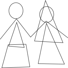
Rough shapes used for wedding couple drawing

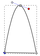
I’d started creating the bride and Scottish groom image in Inkscape by freehand drawing with my Wacom tablet (as I’d done ages ago with a different drawing). After I finished sketching, I selected all the nodes and simplified them (Path > Simplify) to reduce the number of nodes but retain the curves. For example, a freehand line may have 50 nodes, but after simplifying there may only be 5.

I then realised that the shapes I was ending up with were incredibly simple — so I started over again, but using the bezier tool instead of the freehand tool. If you have a look at this basic shape drawing, you can see that the wedding dress in the image is effectively a triangle and the kilt is only a trapezoid.

Then it was down to making the lines curve the way I wanted them to. I did this by selecting individual nodes and using the node tools to make the node smooth (making it a curve instead of a sharp angle). When I did that, I also got handles for the node to adjust the direction of the curve. I adjusted the line between two nodes simply by clicking on the line and dragging it where I wanted it.

The whole wedding couple design was done with simple shapes, making making nodes smooth, and dragging lines around. I then did a bit of colouring but all the colours are solid so I didn’t have to worry about getting gradients correct.

The design is not very complicated, but I think its charm is in its simplicity.

A Talk and Tutorial on Inkscape

I’ll post here later about my talk and tutorial on Inkscape for Falkirk LUG and EdLUG.  I’ll also be sure to put my notes and/or slides here to share.  These are the topics I’m currently planning to cover. If there are any others that you feel need to be mentioned, please get in touch!

  • What is an SVG? How does it compare to a bitmap?
  • What is Inkscape?
  • How do I use the shape tools (square, circle, stars, spirals)?
  • How do I change the fill colour, line colour, and line thickness?
  • How do I combine and subtract shapes?
  • How do I use the freehand and calligraphy tools?

“Sounds like you need a writer.”

Most companies value documentation. I keep talking to software developers who’re working for small companies and they all say “yeah, our boss knows that its important to have documentation, that’s why he has us document as we code…”

It’s great that they know that having documentation increases the customers trust in the product or service. Unfortunately, there’s a “but”.

“But,” my friends tell me “I hate writing the documentation. And I always have to spend so much time figuring out how to write things. I know how to write code, but I’m not sure someone else would understand my documentation…”

Yes, a technical writer takes some time away from the developers, as they need to describe what a product is and how it’s meant to work. But we save time in the long run because we can just get on with the writing — and in the end, we tend to produce much higher quality content and a much better document than your stereotypical software developer.

If the developers at a company are spending a large chunk of their time writing documentation rather than coding, and there’s more work than people, then it may be worth looking into hiring a technical author instead of another developer. The developers you already have can spend more time writing the code they were hired to write and the technical writer can pick up and improve the documentation.

The quality of documentation your company produces is just as important as the quality of the software you write or the service you provide. If you give customers poor documentation, it could affect their opinion of your overall company image.

For more information, refer to the Institute of Scientific and Technical Communicator’s page on Why Use a Professional Communicator?.

Open Source Orientation

How many of you have heard this before:

“I had a look at [product] but I couldn’t quite figure out how it works. There was a community message board, but no real documentation.”

Welcome to the world of open source software, where there is a sad lack of documentation. I know, I’m not really in a position to complain, being one of the people in the community who could write some documentation for community project but hasn’t really. Well, except for this one time…

Picture it – the year is 2010 and I am on the cusp of graduating from university, with a degree in Linguistics and only a year of technical writing experience. I’ve spent the last two years evangelising about the wonder that is the open source community and I want to jump in and do all I can to help. So I went along to the Open Source Jump Start 2010 in London. I’m in a room with 30 other university idealists who want to help something bigger then themselves. There are project leaders from many different open source projects – and they take us by the hand and introduce us to their projects.

That’s the hardest thing, getting started. With no documentation, and no one to explain what this particular program is meant to do, I’m lost. I can read code, but it takes me awhile – like someone with a knowledge of Spanish attempting to puzzle through Portugese. It really does take either a fair amount of discussion on a message board, or a sit-down with one of the developers to really understand how something works.

That was the beauty of the Open Source Jumpstart – the would-be programmers had a chance to discuss the project and its organisation. I, too, had the opportunity to talk to the project leader of the Citrine Scheduler project and write a bit of documentation.

I want to organise something like that in Edinburgh, where I know there are people who would want to get involved, students who need to work on open source projects for their degree and folks who’d love to help out the community but don’t know where to start. That’s what I had said on the day I was there, something I have talked about on-and-off ever since. Now that I’m back in Scotland, I don’t have an excuse anymore.

It’s more than just documentation — documentation helps get your foot in the door, but talking over pizza also helps get your foot in the door.

Anyone else want in?

The TiVo!

“Huzzah!” I say to this magical box that sits under my television. “Hurrah!” I exclaim when I realise it’s already recorded that show that I completely forgot was last night on channel four.

“Why….?” I query, when I realise that I can’t easily navigate through the A-Z show search, that it lists the same show about 5 times in a row and then I realise that’s because it’s listed each episode of that show, but it’s not included the season (series) and episode numbers so I have to go by the description to figure out which one it is that I want.

“Aww hell….” I mutter when I realise that the show search is done in such a way that it records not only “Castle”, but also “Takeshi’s Castle” and “Castle Farm” (whatever those may be….)

“Argh!” I grunt when I notice that the View-On-Demand and View-Upcoming aren’t put together in one easy-to-access place so I can quickly say “I want to watch this old episode now, and record all the future episodes while I’m at it.”

Alas, it isn’t quite the magical box I thought it would be.

But last night, my partner ran through to the office: “Denise! There’s a program on right now that I think you’ll like to see!”
“Oh!” and I launched up from my chair, quizzing him “Well, what is it?”
“Don’t rush, I’ve paused it. It’s just a show I think you might like. I’ve been watching it for a few minutes already.” I paused.
“Oh yeah… we can pause and rewind TV, now…”

I love my TiVo. I feel like I’m master of the universe, able to pause time and watch whatever I want when I’m in the mood for it.

It just needs a bit of ironing out of the kinks.

Writing Tools

One of my fellow technical writers asked me a question that should have been easy enough to answer:

After spending the last year using FrameMaker 8, what would you want to use if you started at a new company that didn’t have any existing documentation? Would you want to go back to LaTeX or would you ask them to pay for you to get FrameMaker?

I was first of all amused that she didn’t assume that I would go for RoboHelp, one of the other documentation programs we use. There was also the assumption that I wouldn’t want to try something I’ve never tried before.

Then I had a think about it.

  • Am I a lone writer because they have very little documentation that needs to be created or am I the first of what will eventually be a team of many?
  • Is the documentation going to be online help, CHM, PDF?
  • How much money does the company have to spend on documentation, after paying me?
  • Does the documentation need to be released as soon as possible or is the software in the early stages of development, giving me time to develop the doc set?

All of these thoughts come together to decide how I would approach new documentation.

I know there are other tools available that I wouldn’t use for customer-facing documents, such as wikis (because of how difficult it is to keep them structured and ensure that all your pages are up-to-date) and plain text files (acceptable for short READMEs, but messy for long documents). There are also long lists of tools that I’ve never used before so don’t know the value of, such as Flare, DITA, and Author-It.

My first technical writing job, I worked for a very small company. I wrote everything in LaTeX, due to the ability to make a nice template, the ease of adding content, and the openness of the software to edit it. Free software to create the doc, ability to output as PDF and HTML. Everyone’s happy, right? Except most people don’t want to have to edit LaTeX because it can sometimes be fiddly and software developers have better things to do than chase an orphaned sentence.

If I were to go back and do it again, knowing what I know now, I would probably do the documentation in Microsoft Word, but with a fixed template. The developers left updating the documentation in my absence would be happy, and marketing could more easily copy text from the documents. Even the cost of the Microsoft Word license is effectively zero since everyone had it anyway. And in the end, I never did need the HTML help.

If I worked for a very small company that needed primarily HTML help and the occasional PDF, I would probably use Adobe RoboHelp. Compared to other documentation software, the license is cheap, I already know how to use it, I can create templates for it, and (as long as I’m very strict about how a project is organised) it can produce good HTML help as well as PDFs.

I’ve mostly enjoyed FrameMaker 8, this last year. Our template is solid and we’ve got a strict style guide, so our documentation is consistent across writers and product suites. I mostly like the user interface and I know that more recent versions have fixed those few things that really rub me the wrong way. It even has the very useful features of conditional text and text insets. But, it’s expensive. It gets even more expensive if you want it to create HTML or CHM, since you need WebWorks ePublisher.

If the company were intent on expanding, both in terms of software suites and staff writers, I’d push for FrameMaker. At that point, they can probably afford the licenses for it, and it gives a much more structured doc set.

If the expanding company also had time to let me research and try different things first, I’d really want to give Structured FrameMaker a try. The idea of XML organisation in documentation makes me pleased as punch and, from what I’ve read about it, sounds like the sort of thing I’d really like to use.

This is one of the things I like about working with different people on different projects – I get to learn about all sorts of new tools. Maybe my next job will need me to learn DITA.

Language Log Name Check

When I walked into the office kitchen yesterday, I overheard some of my software developer comrades discussing Language Log. As I made my way to the coffee machine, one of them asked me “Hey, are you the one mentioned in that Language Log post about ‘Every Little Helps’?”

Completely caught off-guard, I sputtered “uhm, yeah.”, thinking back to the day that I brought the topic up with a lecturer after class, and he posted about it on Language Log to find out what it was all about.

“I KNEW it!” he exclaimed in response. “Though I’m sure there are only so many American undergrads named Denise Wood studying Linguistics in the UK… Cool!” I couldn’t help but wonder to myself if this is the single greatest moment for me in the field of Linguistics, a name-check on Language Log. Instead of an Erdös number, I’ve got a Language Log number of 2 — Though I’ve never posted (not even replied), I was written about by a poster on language Log.

The discussion around the coffee machine then went on to discussing syntax, until another programmer walked into the kitchen and we realised we’d been standing there far too long and rushed back to our desks.

I’m OK with the fact that I’m not really pursuing a career in academia, where I can say “I am a Linguist” when people ask what I do for a living. I’m a technical writer, I work with software programmers. I still get to spend all day thinking about language and how we use it, though. I also get to have these beautiful moments when I realise that the polymath is not a thing of the past — my programmer friends read my favourite blog and can discuss linguistics with as much comfort as they discuss maths, chemistry, and code.